Brand Identity

Cream of the Crop

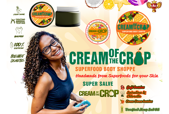
Identity and label system for a vegan skincare startup, built up from a home formulation.

Cream of the Crop
2015 — 2019
Built

About the project

Who. A shopper reading an ingredient list in a crowded skincare aisle, deciding in about four seconds whether a small brand is credible.

What. The product's entire claim was purity — formulations built from fruit and vegetables, nothing you couldn't pronounce. The problem is that purity is the most crowded claim in beauty. Every competitor says it. The brand needed the claim to be visible before a word was read.

How. Colour taken directly from the ingredients rather than from a trend palette, so the shelf did the arguing. Typography set for legibility on small curved surfaces. Then a label system rather than a set of labels — one hierarchy that holds whether the product name is two words or six, so the line could grow without a redesign.

Outcome. Identity, colour, typography and packaging-ready artwork delivered as one system, built to extend across a full skincare range.

A formulation made at a kitchen table — skincare built from fruit and vegetables, nothing in it you could not pronounce. The claim was purity, and purity is the most crowded claim in beauty. Every competitor says it, so saying it louder was not an option.

What got settled first was the shopper: someone reading an ingredient list in a crowded aisle, deciding in about four seconds whether a small brand is credible. That four seconds is before a word is read, which meant the claim had to be visible rather than written.

Result: A position that could not be copied by wording — the purity had to be seen, not stated.

Colour taken directly from the ingredients rather than from a trend palette, so the shelf did the arguing before the copy did. Typography set for legibility on small curved surfaces, which is where most small-brand labels fail.

Then a label system rather than a set of labels — one hierarchy that holds whether the product name is two words or six, so the range could grow without a redesign every time something was added.

Result: Identity, colour and typography delivered as one system rather than a single product's artwork.

Packaging-ready artwork delivered to production spec, with a print specification written for the label vendor rather than for a designer.

Result: A formulation made at home arrived on a shelf looking like something a shopper would trust in four seconds.

Ingredient-led colour research rather than a trend palette

Legibility testing on small curved surfaces before the label was signed off

Hierarchy built to hold product names from two words to six

Packaging-ready artwork delivered to production spec

Print specification written for the label vendor

2
4

What customers said

Reviews

“The product's whole claim was that you could pronounce every ingredient. The label had to look like that was true.”

Results
  • Identity, colour system and typography built for a full skincare line rather than a single product.
  • Label system designed to scale across formats without redrawing the hierarchy each time.
  • Packaging-ready artwork delivered to production spec.
Client
Cream of the Crop
Discipline
Brand Identity
Timeline
2015 — 2019
Position
Built